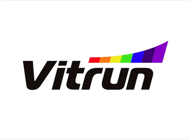
02. Brand Positioning & Identity Design
Vitrun
- Worked For
- Vitrun
- Platform
- Corporate Identity
The design was conceptualized to celebrate everyday vitality, active movement, and the complete spectrum of nutritional wellness. Bold, italicized typography for "Vitrun" was engineered with forward-leaning momentum, capturing the athletic drive and energetic pace of an active lifestyle. Above the wordmark, a soaring rainbow arc unfurls like a vibrant running track, representing the full spectrum of essential vitamins and minerals working in total synergy. The solid black lettering provides a strong foundation of daily trust and scientific reliability, while the upward sweep of color brings optimism, lightness, and enduring stamina. Together, the identity inspires people to fuel their bodies with comprehensive nutrition and embrace every day at full stride.